Air3
What we did
Back in 2015 Orangebox released Air3, a series of flexible room systems which further strengthened their position of innovators within the furniture industry.
The Air3 pods could be assembled to create a semi-permanent room with all the mod-cons you would expect in a contemporary meeting room. They've taken the market by storm and have more than earned their place in the Orangebox portfolio.
Client
Orangebox Ltd
Identity
- Logo
- Sub Branding

Logo
We decided to visit Orangebox's design & development hub in Huddersfield to get a really good understanding of the product.
Our objective was to create an identity that not only takes clear influence from the product but is versatile enough so it can be easily applied to lots of different materials.
The logo can sometimes be seen with a supporting strapline which succinctly explains the product in a lowercase typeface which makes it friendly and easy to read.
Sky blue was chosen as the primary colour because it relates to clean air and ventilation, which are two of the many selling points of the product.
Sub Branding
We designed a sub identity for the patented, intelligent roof system called Airo.
This logo not only compliments the Air3 brand but it subtly suggests how the roof system works with the cycle of warm air leaving the pod and cool fresher air circulating back in.
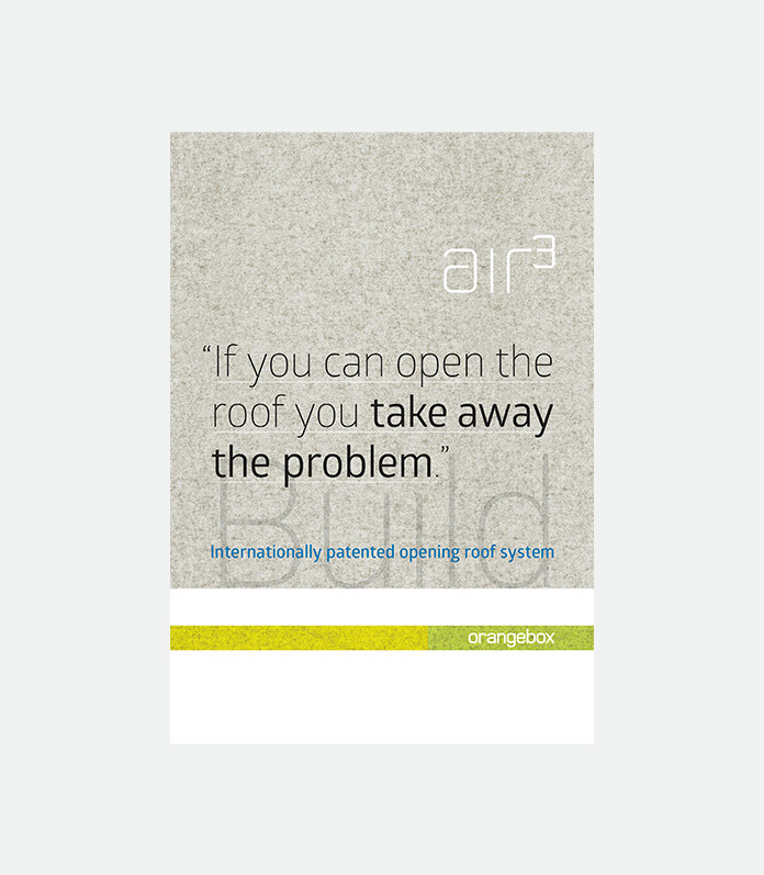
- Poster
- Brochure
Poster
We created a folded poster that would highlight the key features of the product range. The idea was to provide the customer with all the information about the product including the acoustic values, fire safety, ventilation, lighting and electrics. This was carried out using large quotes, detailed renders, illustrations and compelling narrative.
We used a felt texture in the background to represent the soft fabric used on the acoustic panels of the pods.
This poster received great feedback from clients at the Air3 launch in the Orangebox's London showroom.
Brochure
The brochure is a full scope document providing its reader with everything they need to know about this vast modular product.
It was designed to be both a beautiful look-book and a technical guide which can be used as a reference when purchasing the product. A series of colour coded divider pages were created to make each section easy to locate.
The pages are very crisp with plenty of white space making the content easy to read. Most pages use full bleed imagery for maximum impact and the right use of uppercase type gives the correct hierarchical balance.


Having worked with Marcus for over 22yrs I cannot speak highly enough of his creative approach and professionalism toward his work, no matter what media.
Luke Palmer Principle Designer


Digital
- Holding Page
Holding Page
Air3 is one of Orangebox’s flagship products and it was decided early on that it required its own microsite.
This would be a place dedicated to presenting the product in detail. The website was to be launched at Clerkenwell Design Week so it coincided with the unveiling of the collection at their London Smartworking showroom.
It was agreed that a holding page should be created first, to generate the right level of interest before the launch.
We wanted to be experimental so we chose to control animation on scroll which would help describe and highlight the core features of the product, whilst keeping the viewer engaged.